- Logo
- Our company
- Our brands
- Sustainability
- Social impact
- Careers
- News
- Investors
- Search
- Language
- Reciteme
Search

How AHA, Coke’s New Flavor-Forward Sparkling Water, Will Come to Life on the Shelf
Creating a "Brand" New Look
11-07-2019
When it comes to launching a new beverage – especially in a category as crowded and competitive as sparkling water – what’s outside the package is as, if not more, important than what’s inside.
From a memorable brand name and logo, to eye-catching packaging designs that stand out on the shelf, to buzzworthy advertising and social media content, curating a distinctive look-and-feel is key to a successful debut.
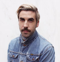
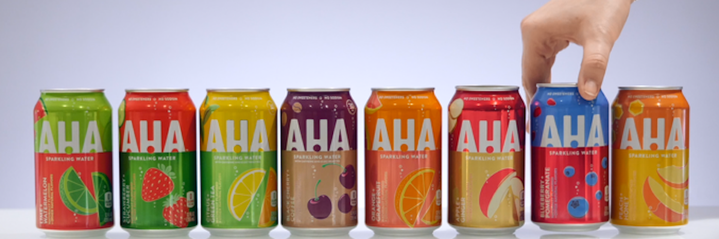
We spoke with Trey Veal, who oversees visual identity system development and packaging design for Coca‑Cola North America’s water and active hydration portfolio, and Julie Siwemuke, sparkling water director, Coca‑Cola North America, to get the scoop on the branding for AHA, a new flavored sparkling water hitting the market in March 2020. Eight flavor-forward and aromatic pairings – Lime + Watermelon, Strawberry + Cucumber, Citrus + Green Tea, Black Cherry + Coffee, Orange + Grapefruit, Apple + Ginger, Blueberry + Pomegranate and Peach + Honey – will set AHA apart from the competition not only through its taste and added caffeine in two flavors, but also its visual identity.
What was your team’s initial brief?
Trey: The brand challenged us to bring AHA and its eight delightfully unexpected flavor pairings to life visually, and to create a mainstream brand with an ownable, relatable personality. We partnered with Taxi Studio in Bristol, U.K. on the project.
Julie: Research shows that sparkling water drinkers bounce around from brand to brand, so we set out to create a brand that looks and feels like it’s truly for you.
Did the brand name inspire the designs, or vice versa?
Julie: As we started to create the essence of this new brand and what we wanted it to stand for, vitality and positive potential were at the top of the list. We knew we wanted the name and look to be expressive and full of life, and for our unique flavor pairings and sensory experiences to create an element of discovery, differentiation and delightful surprise.
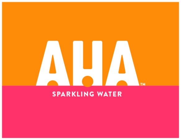
Trey: The brand name definitely inspired the design. Arriving at the AHA name opened up a lot of creative opportunity for us. It suggests an element of surprise and delight, which comes through in these refreshingly different flavor pairings, 30mg of added caffeine in two flavors and other attributes you don’t expect from sparkling water. We embedded a fun, subtle exclamation point in the “H” of AHA logo as a bit of a creative wink, and we included some fun romance copy that speaks to the need states certain flavors appeal to. These include “Flavors to Invigorate Your Vibe”, “A Renewed Sense of Hydration” and “A Can of Cool You Down”.
How many design iterations did you go through?
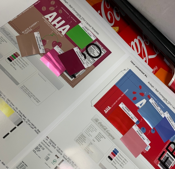
Trey: Quite a few. Our initial explorations centered on a more white or neutral base. But we realized that the look skewed too premium, whereas a bright, single-color treatment wasn’t premium enough. We had to find a middle ground, which is how we ended up with these lovely split-color designs, which are fun without being tacky or loud and clearly showcase the flavor pairings.
How important is packaging as a communications tool, especially for a new brand?
Julie: Packaging is essentially our on-shelf billboard, and in many cases is consumers’ first touch point with our brands. Shoppers see our packs on the store shelf, or notice someone drinking a bottle or can out in public. It’s an incredibly valuable asset, so it has to stand out and make an immediate impression. Especially with a new brand like AHA in a category like sparkling water.
'Packaging is essentially our on-shelf billboard, and in many cases is consumers’ first touch point with our brands. Shoppers see our packs on the store shelf, or notice someone drinking a bottle or can out in public. It’s an incredibly valuable asset, so it has to stand out and make an immediate impression. Especially with a new brand like AHA in a category like sparkling water.'
How will the brand’s visual identity manifest across all communications touch points?
Trey: We took steps to make sure everything connects and builds on the core visual assets we’ve created – the color splits, the fruit illustrations – and captures the feelings these pairings address.
The AHA launch process was essentially a sprint, with compressed timelines and several parallel work streams. What does this say about the Coca‑Cola growth culture?
Trey: It was fast and furious, indeed! A packaging redesign for an existing brand usually takes around 18 months. With AHA, we developed, built and launched a completely new brand with eight flavors in just over six months. That meant we had to be extremely nimble and stay on our toes throughout the process.
Julie: Because everyone had to move so quickly and stay on the same page, the collaboration took on an extra layer of trust and empowerment. It pressure-tested us to use our intuition. There was no time to ponder things for too long, or to get stuck in the minutia of approvals. We stayed focused on our work and would regroup regularly to sweat the details and glue everything together. We all trusted and supported each other, which was empowering from a creative standpoint and ultimately paid off in the designs we delivered.
