Coca‑Cola Supports Marriage Equality in Australia With Limited-Edition Cans
"Love" Story
09-20-2017
For the first time in 131 years, Coca‑Cola is using its iconic Spencerian script for something other than its logo.
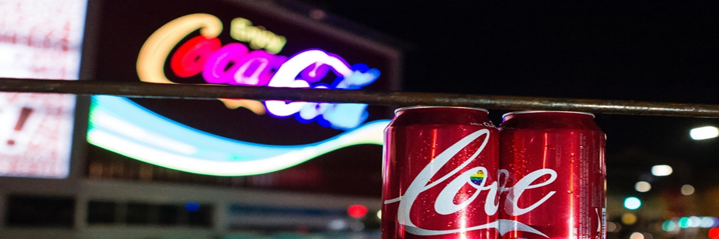
This month, in response to Australia’s postal survey on marriage equality, Coca‑Cola Australia launched a limited- edition Coke can featuring the world love in Coca‑Cola’s celebrated font, complete with two hearts – one rainbow filled.
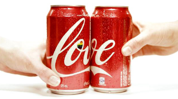
“The word ‘love’ is reflective of our core values. If ever we were to experiment with Spencerian script, this is the time to do it,” said James Sommerville, Coca‑Cola VP of global design, who helped conceptualize these cans.
This month, in response to Australia’s postal survey on marriage equality, Coca‑Cola Australia launched a limited- edition Coke can featuring the world love in Coca‑Cola’s celebrated font, complete with two hearts – one rainbow filled.
A Love Story
Looking at the word love as it appears on these cans, Sommerville is interested in what he calls the “anatomy of its typography.”
“The way the characters flow it seems to have a loving flavor to it – a loving construct – because it has almost been written by hand, like a love story," he explains.
True to the experience of Coca‑Cola, the hearts embedded within the script provide a feeling of surprise and delight that might not be noticed at first glance. With only one of the two hearts a rainbow, the can may tell a story of LGBT Pride, but can also speak to any other tale of love.
It is an extension of the company’s statement, “No matter who you are or who you love, all couples should be treated equally.”
Though historic in method, this is by no means Coca‑Cola’s first statement in support of love. Coca‑Cola’s Kings Cross sign in Australia has previously sported the rainbow flag. Coca‑Cola advertisements have not only been LGBTQ inclusive, but LGBTQ celebratory. The company has been a vocal Pride-sponsor, and the Human Rights Campaign Foundation consistently praises the company’s LGBTQ workplace equality practices.
In conjunction with the release of the cans, the company celebrated its commitment to inclusion with this statement: “Coca‑Cola believes in the power of bringing people together. Whether it was the struggle for human rights in the United States in the 1960’s to a group of young people from many nations on a hilltop in Italy in 1971, around the world we’ve always stood up for diversity, inclusion and equality.”
Jacqui O’Donnell, Coca‑Cola South Pacific’s marketing manager, further explains, “Equality and diversity are hugely important to who we are as a brand and as a company. The idea was a very simple, but powerful and locally relevant way to support everyone who drinks, distributes and sells our brand.”
Coca‑Cola’s South Pacific Design Lead Ian Swanson agrees, “Coca‑Cola is for people; it’s for everyone – the human race in all its diversity. This was an opportunity to use our iconic packaging to express a simple, strong, critical idea.”
In considering this history of inclusion and the design of the love cans, Sommerville’s eye focuses just below the upper rim, which reads, classic.
The pairing of these words with ‘love’ gives Sommerville great pride. “We’ve been writing classic love stories since 1886 and this just adds another chapter to that heritage of great storytelling,” he says. “Being asked by the Australian Business Unit to collaborate with them in this design project is reflective of a new way of working.”
A Business Innovation Story
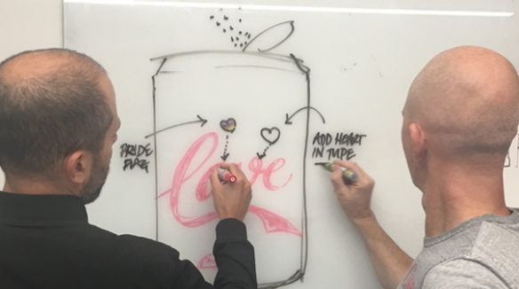
Once it was announced the postal survey would go forth, James Sommerville and his colleague Rapha Abreu, a Global Visual Identity Design Director, jumped into action to create the cans.
Two days later, the designs were crafted and approved. Nine days after that, with input from the local team, the cans were in Australians’ hands.
This rapid design sprint was an in-house collaboration between the Coca‑Cola Australia and the Atlanta-based Global Design, Brand and Legal Team -- a "love story" expedited by cross-functional collaboration across time zones.
“These cans are a great example of what we can do with speed in two different markets and end on something magical,” Sommerville said. “This way of working represents a new era and new, iterative design methodology for the organization, yet on our most prestigious pack.”
He credits his colleagues in Australia for their progressive thinking in exploring new ideas. Among other innovative marketing strategies, the concept of Share a Coke, which enables consumers to customize their Coca‑Cola packaging with their own names, originated Down Under.
With Share a Coke, the design team developed a Spencerian-inspired font to preserve the equity of the Coca‑Cola trademark logo as it has been preserved for more than 130 years.
But for this story of love, the signature script was worth bending for the first time.
